
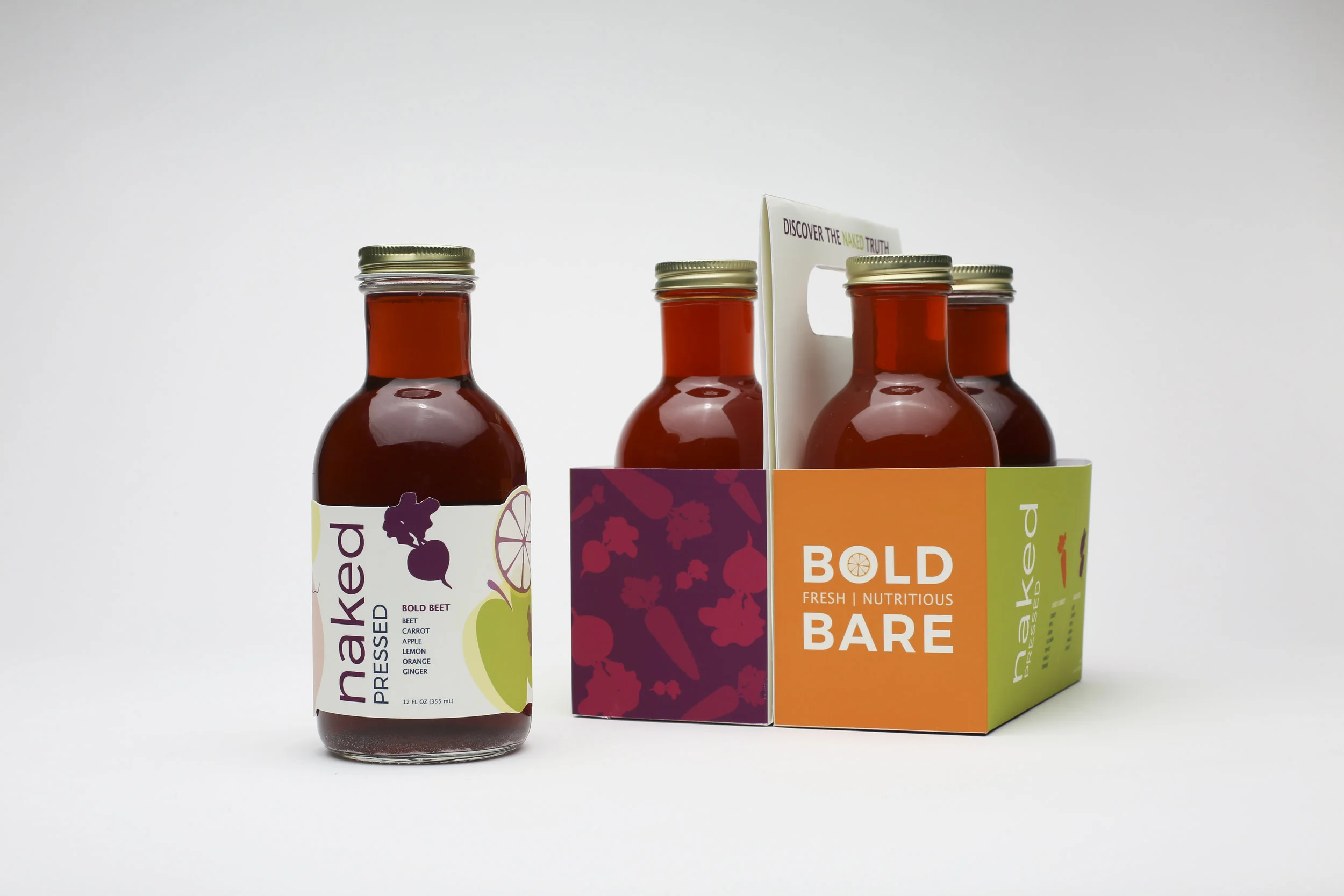
naked compressed juice rebrand
This rebrand focuses on the fresh and organic aspects of compressed juice. The idea was to use a bottle that was round and full in its body to mimic the organic shapes of fruits and vegetables. The label uses illustrated shapes of fruits and vegetables used in the drink to create a design that is unique and upscale. The label is di-cutted to further emphasize the natural qualities of the juice.
The target audience for this redesign is healthy millennials who are very attracted to the hip, new, trending juices and drinks. They can afford to pay an elevated price in order to maintain a more balanced and nutritious lifestyle. This audience is passionate about nutrition, health, and fitness.


moodboard

process | sketches, illustrations, label design variations


